Example 2: Confusion Analysis using Mapper Algorithm
In this notebook, we analyze a dataset of handwritten digits using the Mapper algorithm, a powerful tool from topological data analysis (TDA). Mapper helps us uncover regions in the dataset where samples are hard to classify. By applying Mapper to the digit dataset, we generate a graph where each node represents a group of similar samples. We color the nodes based on the entropy of their digit labels, allowing us to identify areas of high ambiguity. These high-entropy nodes typically contain images that are visually similar but belong to different digit classes, making them more challenging to classify correctly. The goal of this analysis is to demonstrate how Mapper can provide insights into classification problems by revealing these ambiguous regions and offering an intuitive way to explore them.
Mapper pipeline
To begin, we load the Digits dataset, which consists of 8x8 pixel images of handwritten digits. We then apply Principal Component Analysis (PCA) to reduce the dimensionality of the dataset from 64 features to just 2. These two principal components will serve as the input for the Mapper algorithm, providing a lower-dimensional “lens” through which we will analyze the structure of the data.
[1]:
import numpy as np
from sklearn.cluster import AgglomerativeClustering
from sklearn.datasets import load_digits
from sklearn.decomposition import PCA

from tdamapper.cover import CubicalCover
from tdamapper.learn import MapperAlgorithm
from tdamapper.plot import MapperPlot

X, labels = load_digits(return_X_y=True)
y = PCA(2, random_state=42).fit_transform(X)
The Mapper algorithm relies on two key parameters: cover and clustering. The cover defines how the data is partitioned into intervals, while the clustering method groups the data points into clusters based on their proximity in the reduced space. Choosing the right settings for these parameters is crucial, as they directly influence the structure of the Mapper graph. In this notebook, we use a CubicalCover with 10 intervals and 50% overlap between intervals, along with AgglomerativeClustering to form 10 clusters. However, finding the best parameters often requires experimentation based on the specific dataset and the problem at hand.
[2]:
mapper = MapperAlgorithm(
    cover=CubicalCover(n_intervals=10, overlap_frac=0.5),
    clustering=AgglomerativeClustering(10),
    verbose=False,
)

graph = mapper.fit_transform(X, y)
print(f"nodes: {len(graph.nodes())}, edges: {len(graph.edges())}")
nodes: 381, edges: 736
Visualization
To explore the results of the Mapper algorithm, we visualize the Mapper graph, where each node represents a cluster of similar images. We color the nodes based on the mode of the digit labels in each cluster. The mode gives us a sense of the most common digit in each cluster. As shown in the plot, the nodes are well-clustered by color, indicating that the digit labels align well with the topological structure of the dataset. This suggests that the Mapper algorithm has successfully identified regions where samples are more homogeneous in terms of their labels.
[3]:
def mode(arr):
    values, counts = np.unique(arr, return_counts=True)
    max_count = np.max(counts)
    mode_values = values[counts == max_count]
    return np.nanmean(mode_values)


plot = MapperPlot(graph, dim=3, iterations=400, seed=42)

fig = plot.plot_plotly(
    colors=labels,
    cmap=["jet", "viridis", "cividis"],
    agg=mode,
    title="mode of digits",
    width=600,
    height=600,
    node_size=0.5,
)

fig.show(config={"scrollZoom": True}, renderer="notebook_connected")
We also color the nodes by the entropy of their digit labels, which measures the level of label diversity within each cluster. High entropy indicates that a node contains a mix of different digits, suggesting that the samples in that node are more ambiguous or harder to classify. In the plot, we observe that most nodes have low entropy, meaning that each node is typically dominated by a single digit class. However, high-entropy nodes (which are rarer) represent areas where multiple digits appear together, highlighting regions of the dataset that are particularly challenging for classification.
[4]:
def entropy(arr):
    values, counts = np.unique(arr, return_counts=True)
    probs = counts / counts.sum()
    return -np.sum(probs * np.log2(probs))


fig = plot.plot_plotly(
    colors=labels,
    cmap=["jet", "viridis", "cividis"],
    agg=entropy,
    title="entropy of digits",
    width=600,
    height=600,
    node_size=0.5,
)

fig.show(config={"scrollZoom": True}, renderer="notebook_connected")
Identifying high-entropy
Next, we focus on the nodes with the highest entropy—those that are most likely to contain ambiguous or misclassified digits. These high-entropy nodes often represent regions in the dataset where the model may struggle, due to visual similarities between different digits. We extract the top 5 nodes with the highest entropy and explore their contents. By identifying these nodes, we can pinpoint areas where the model might need improvement or further refinement.
[5]:
from matplotlib import pyplot as plt

from tdamapper.core import aggregate_graph

nodes_entropy = aggregate_graph(labels, graph, entropy)

sorted_nodes = sorted(nodes_entropy, key=lambda n: nodes_entropy[n])
high_entropy_nodes = sorted_nodes[-5:]
print(high_entropy_nodes)
[113, 212, 129, 291, 51]
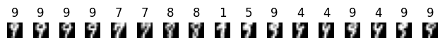
Then, we take a closer look at the samples inside that node with maximum entropy. We can see that inside this node a few different classes mix up. If we plot the images inside this node we can easily see that these appear distorted and could possibly be misclassified.
[6]:
highest_entropy_node = high_entropy_nodes[-1]
node_ids = graph.nodes()[highest_entropy_node]["ids"]
node = [X[i, :] for i in node_ids]
node_labels = [labels[i] for i in node_ids]
fig, axes = plt.subplots(1, len(node))
for dgt_tgt, dgt, ax in zip(node_labels, node, axes):
    ax.imshow(dgt.reshape(8, 8), cmap="gray")
    ax.axis("off")
    ax.set_title(dgt_tgt)
plt.tight_layout()
plt.show()
Conclusions
In this notebook, we demonstrated how the Mapper algorithm can be used to uncover ambiguous regions in a labeled dataset, such as the Digits dataset. By visualizing the Mapper graph and using label statistics like mode and entropy, we identified regions where the model might face challenges due to visual similarities between different digits. This approach offers a powerful tool for debugging classifiers and gaining insights into areas where a model could be improved. Further exploration could involve testing Mapper on other datasets or integrating it with other machine learning techniques to improve classification performance.