Example 1: Exploring Shape
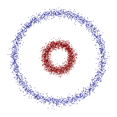
In this notebook, we use the Mapper algorithm to analyze a toy dataset composed of two concentric circles. This simple example is a classic case in topology and machine learning, and it’s perfect for gaining an intuitive understanding of how Mapper captures shape. Although this dataset is synthetic and well understood, it’s ideal for visualizing how Mapper detects underlying topological structures—in this case, two distinct loops. The resulting Mapper graph should ideally reveal two connected components, corresponding to the two circular regions.
Mapper pipeline
We generate a synthetic dataset using make_circles, which creates two concentric circles in 2D space. To prepare the data for Mapper, we apply Principal Component Analysis (PCA) to extract the top two components. These will serve as our lens function, which helps Mapper cover the data in a meaningful way. Even though the dataset is already 2D, PCA is still a useful and consistent choice for this example, especially when scaling up to higher-dimensional problems.
[1]:
import numpy as np
from matplotlib import pyplot as plt
from sklearn.cluster import DBSCAN
from sklearn.datasets import make_circles
from sklearn.decomposition import PCA

from tdamapper.cover import CubicalCover
from tdamapper.learn import MapperAlgorithm
from tdamapper.plot import MapperPlot

X, labels = make_circles(n_samples=5000, noise=0.05, factor=0.3, random_state=42)

fig = plt.figure(figsize=(5, 5), dpi=100)
plt.scatter(X[:, 0], X[:, 1], c=labels, s=0.25, cmap="jet")
plt.axis("off")
plt.show()
# fig.savefig("circles_dataset.png", dpi=100)

y = PCA(2, random_state=42).fit_transform(X)
We now build the Mapper graph using the PCA output as the lens. Mapper requires two key components:
A cover algorithm that defines how the data is grouped together along the lens
A clustering algorithm that splits each set of the open cover.
In this example, we use a cubical cover with 10 intervals and 30% overlap, and we apply DBSCAN for clustering, which is well-suited for identifying arbitrary shapes. Choosing these parameters often involves some trial and error based on the dataset and the desired resolution of the Mapper graph.
[2]:
mapper = MapperAlgorithm(
    cover=CubicalCover(n_intervals=10, overlap_frac=0.3), clustering=DBSCAN()
)
graph = mapper.fit_transform(X, y)
print(f"nodes: {len(graph.nodes())}, edges: {len(graph.edges())}")
nodes: 59, edges: 123
Visualization
We visualize the Mapper graph by coloring each node according to the mean class label (0 or 1). Since the dataset contains two classes—one for each circle—this coloring helps us verify whether the graph structure aligns with the true geometry of the data. Ideally, nodes corresponding to the inner and outer circles will show clear separation in color, revealing two distinct connected components in the graph.
[3]:
plot = MapperPlot(graph, dim=2, iterations=60, seed=42)

fig = plot.plot_plotly(
    colors=labels,
    cmap=["jet", "viridis", "cividis"],
    agg=np.nanmean,
    width=600,
    height=600,
)

fig.show(config={"scrollZoom": True}, renderer="notebook_connected")
# fig.write_image("circles_mean.png", width=500, height=500)
To explore areas where the two classes might overlap or be hard to distinguish, we color each node by the standard deviation of class labels. A low standard deviation (close to 0) indicates that all samples in a node belong to the same class, while a higher value suggests label ambiguity within the node. This helps highlight transitional regions in the dataset where class boundaries may not be as sharp—useful when analyzing real-world data where such ambiguity is common.
[4]:
fig = plot.plot_plotly(
    colors=labels,
    cmap=["jet", "viridis", "cividis"],
    agg=np.nanstd,
    width=600,
    height=600,
)

fig.show(config={"scrollZoom": True}, renderer="notebook_connected")
# fig.write_image("circles_std.png", width=500, height=500)
Conclusions
This simple example demonstrates how the Mapper algorithm can uncover meaningful topological structures, even in a basic synthetic dataset. By combining dimensionality reduction (PCA), a thoughtful cover strategy, and clustering, Mapper captures the two-loop shape of concentric circles and visualizes label consistency and ambiguity across the dataset. This forms a solid foundation for applying Mapper to more complex, real-world datasets.